Postal is a marketing tool that lets requiters physical send item to potentials customers. While I was working there Postal added 3 new products a Branded Swag Store, analytics and concierge service. I was hired on as a Ui/Ux designer and was in charge of redesigning the main product and related projects.
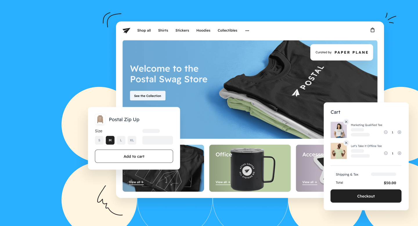
When I brought on the Postal team. They just finished getting funding and was looking to redesign the whole product. So I and Matt when crazy with different designs. I was favoring the sidebar navigation as I thought it would solve our growing navigation issue. But in the end we decided to go with a more traditional top navigation.
Send Flow
A small snippet from the send flow. This covers a golden flow from product information page to review and send. I decided not to show all the other methods and configuration or else there would be like 20 screens.
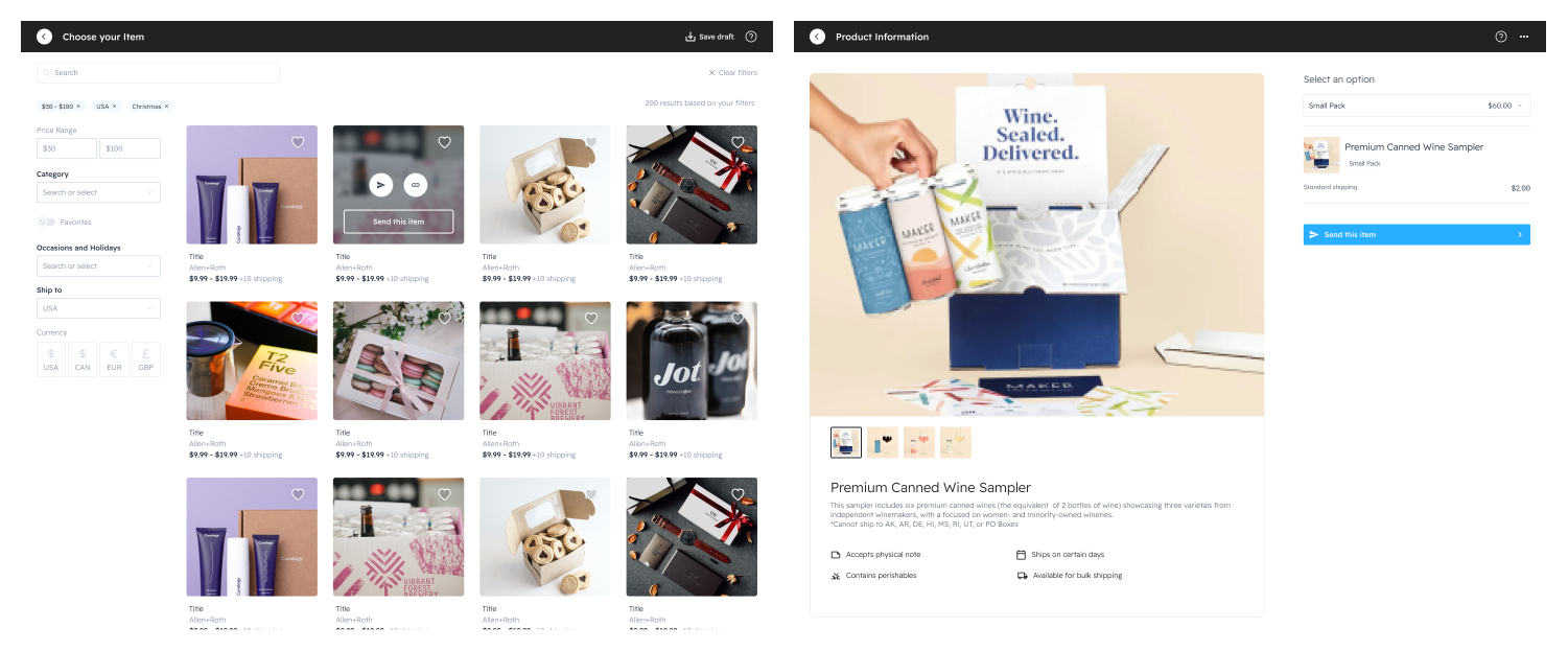 User Send Flow Part 1, From Marketplace to configuration
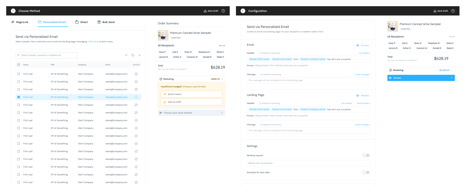 User Send Flow part 2, from configuration to finish.
Recipient Flow
In order to receive the gift or swag a recruiters can require the user to fill out a form or set another meeting for a future date. This shows that user flow.
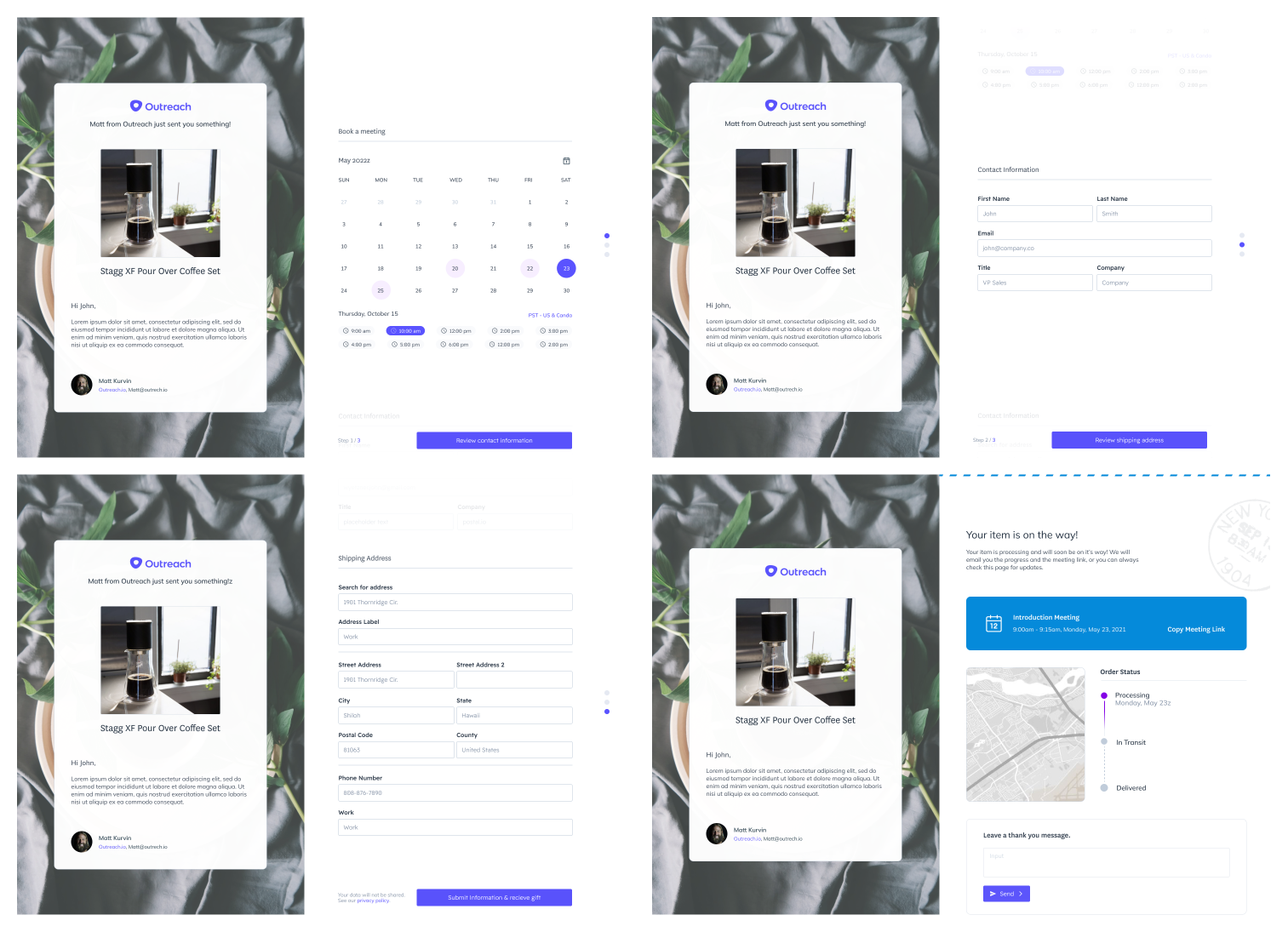 Reciepent accepting a gift userflow.
Design System
One of my man tasks at postal was creating and managing our design library in Figma. Beside creating reusable component for the design team. One of our main goal was to provide prescriptive documentation for the developer.
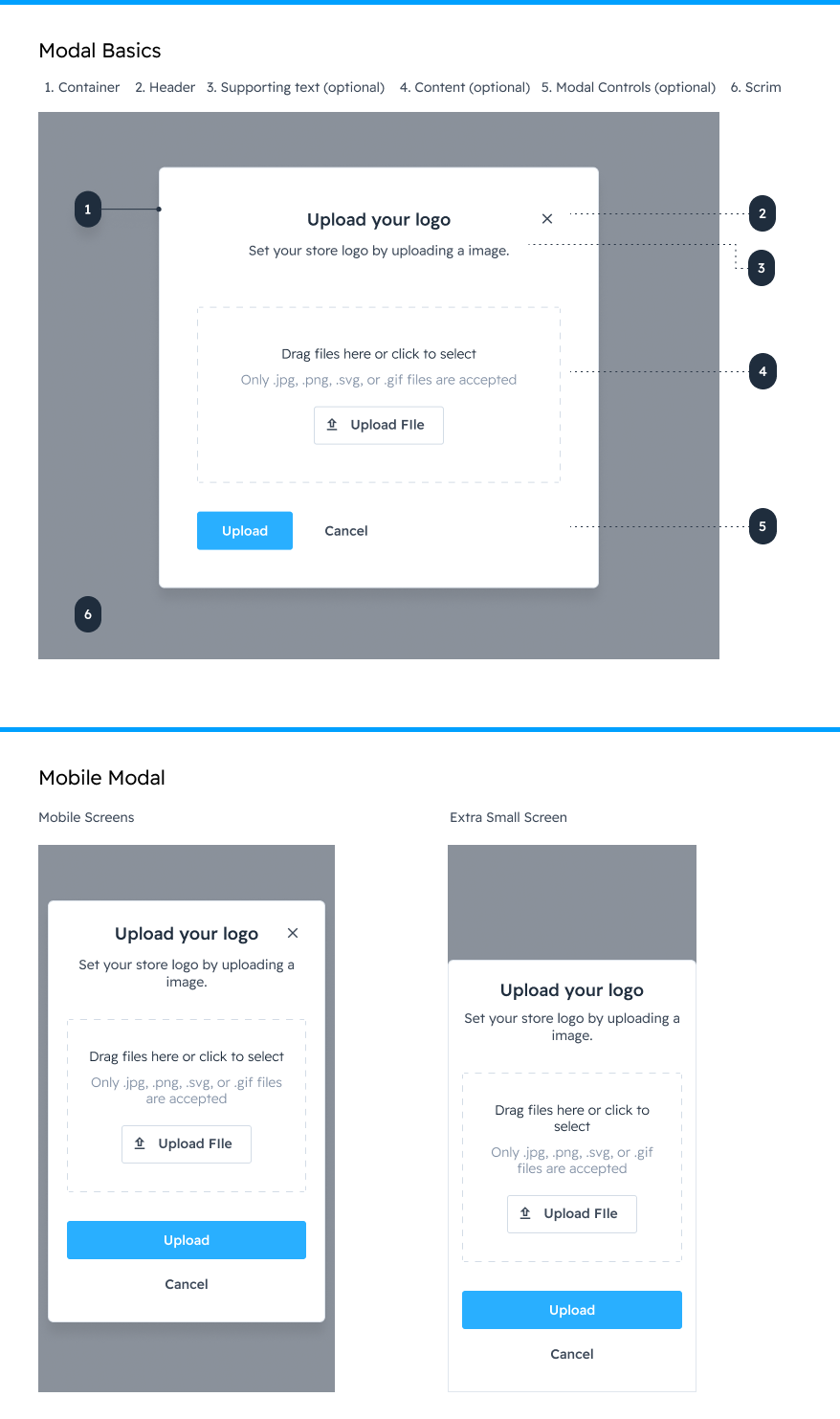 Modal example from design system
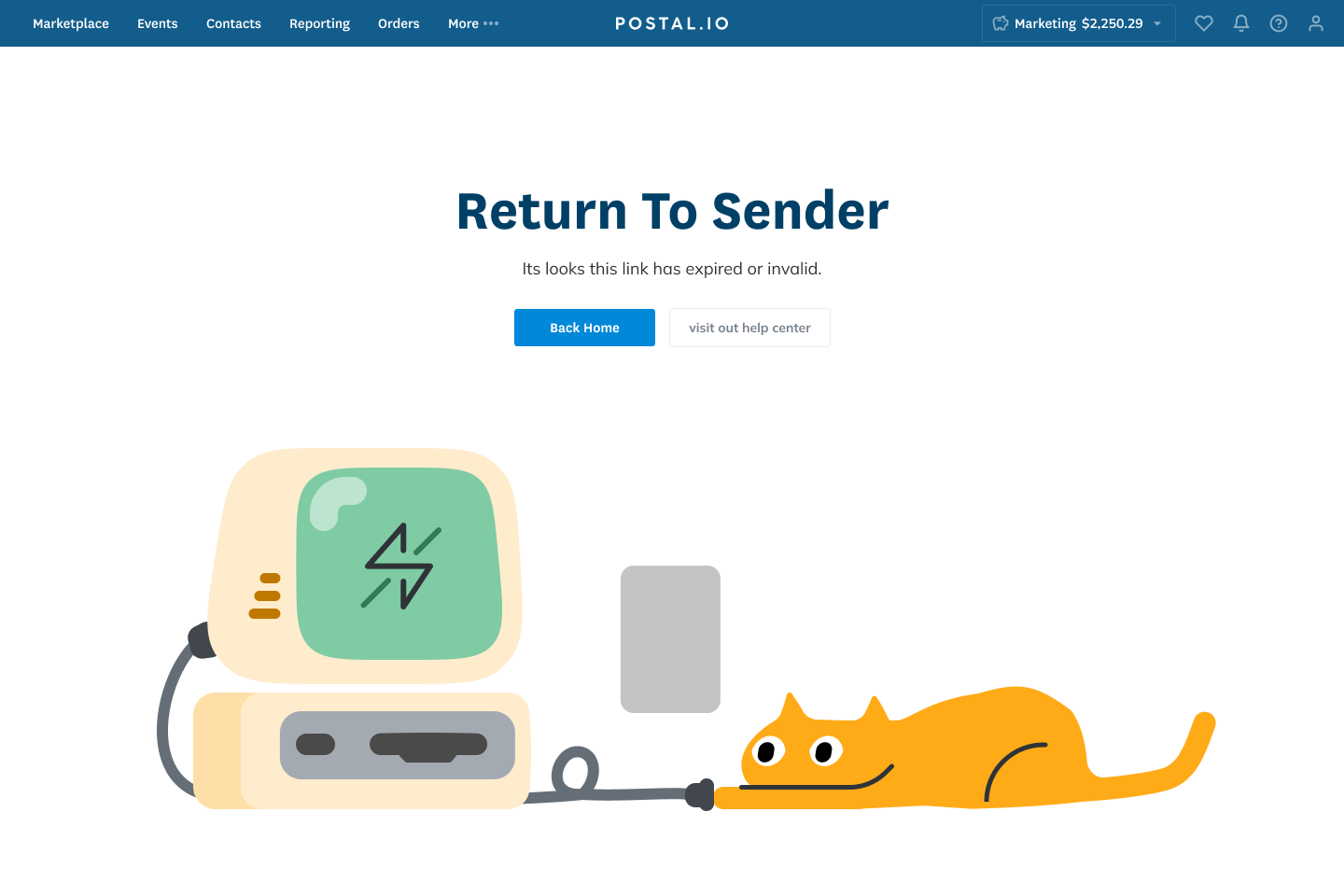
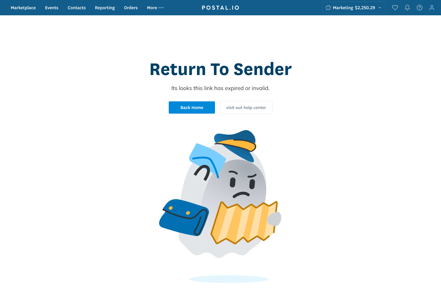
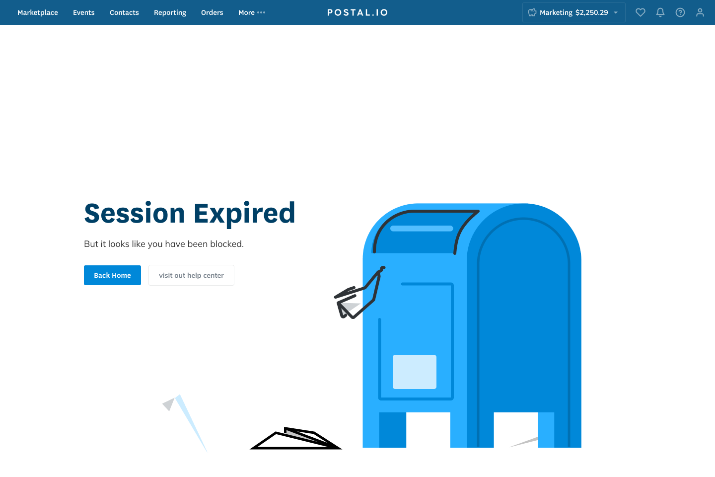
Early Illustrations
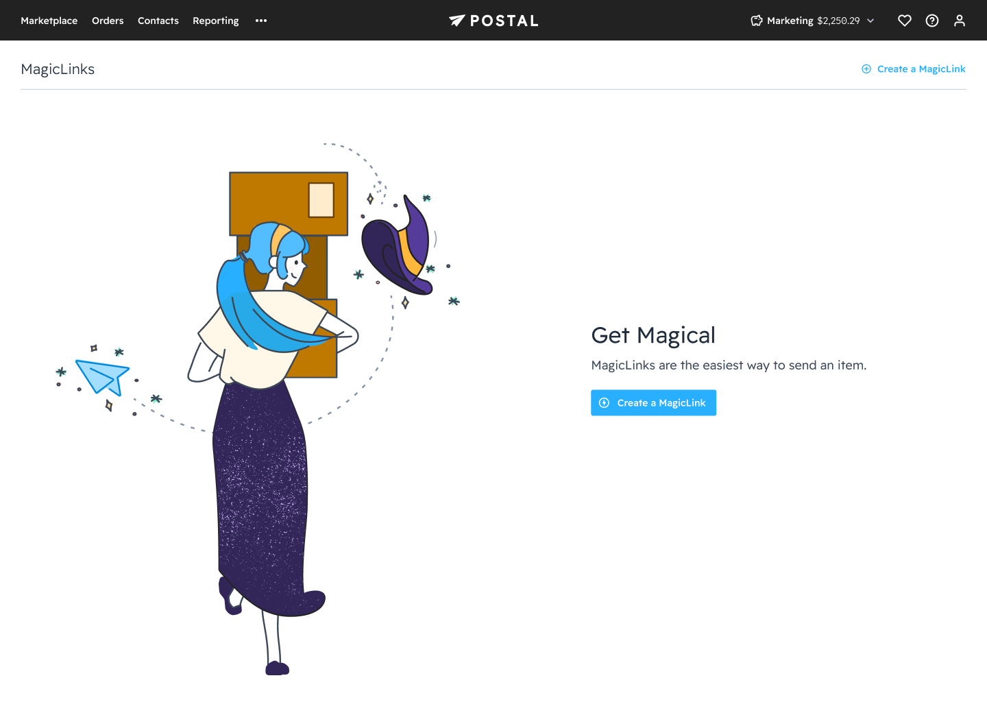
When I joined Postal needed some error state. So I made some simple drawings to go with the error states. These would later get replaced after the marketing team finished rebranding Postal.
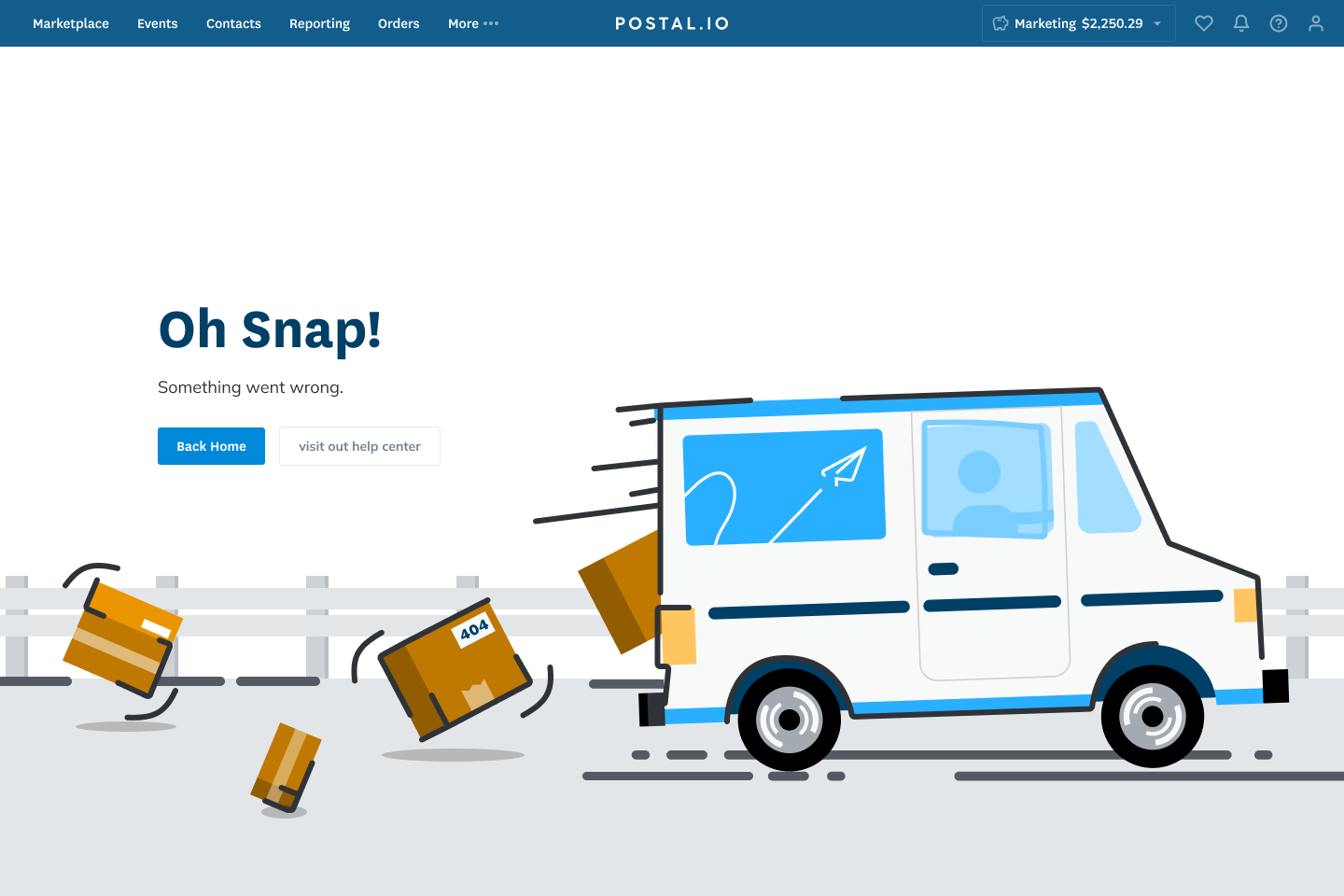
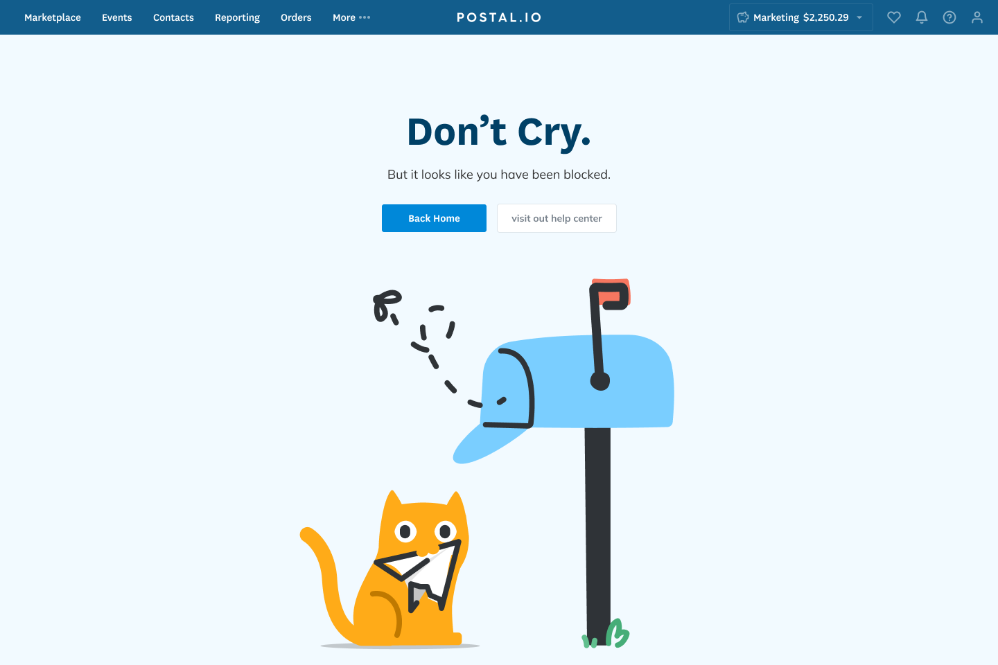
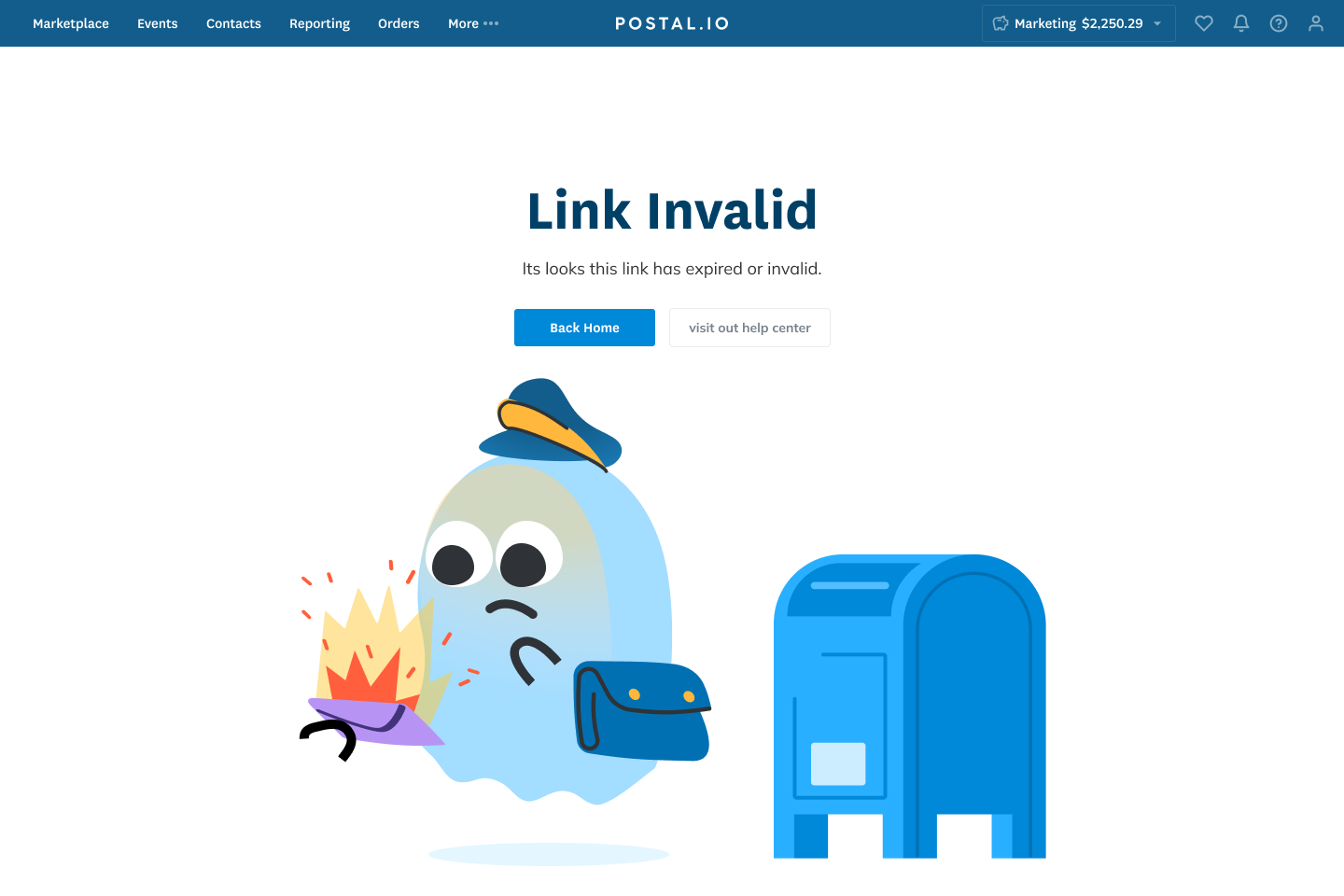
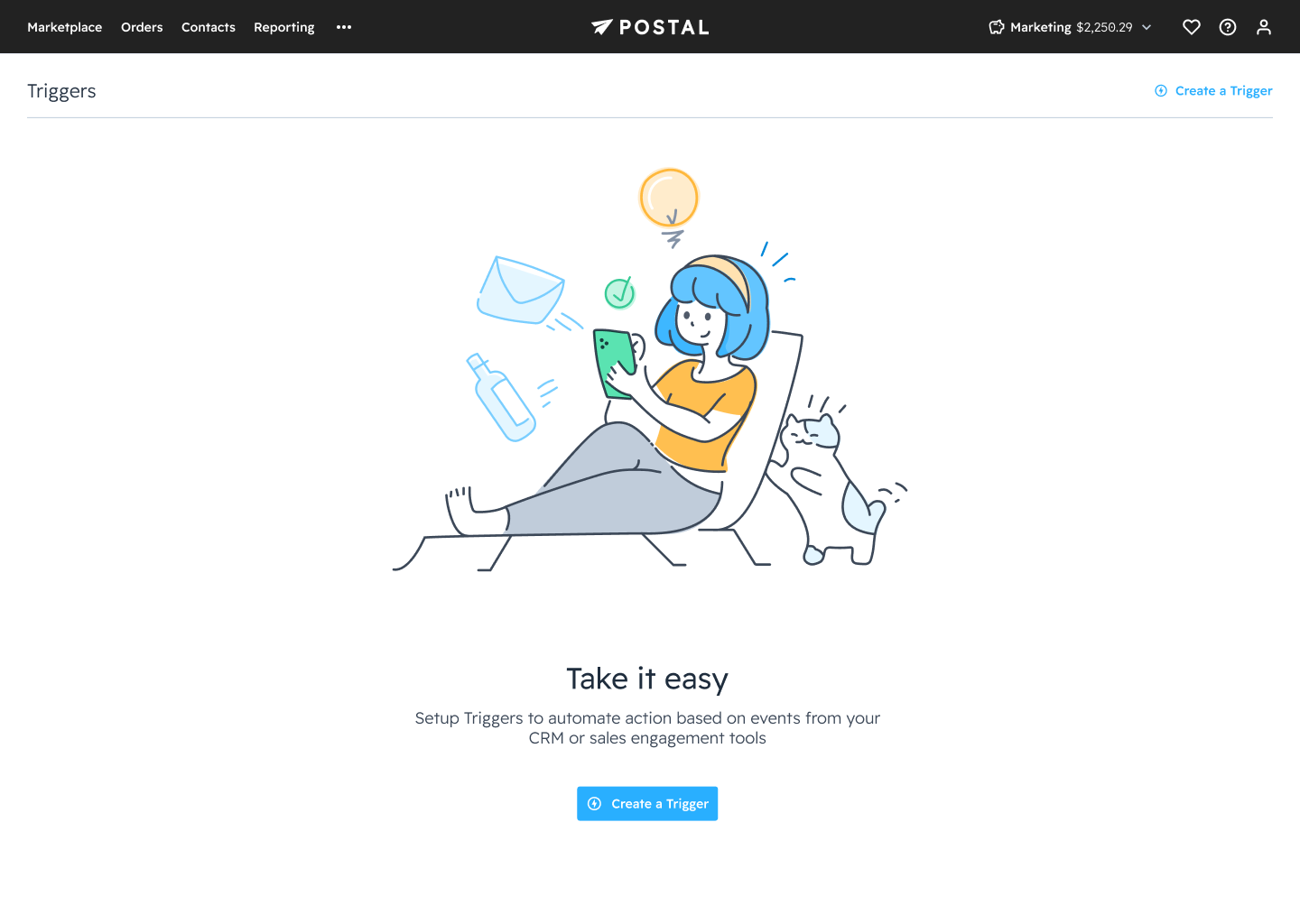
Final Illustrations
Later to better match with the redesign the brand team was doing while we were design the interface. We started redoing the illustrations styles with the new brand colors and to focus on people doing tasks.
Chrome Extension
Waiting on permission to show the work on the chrome extension. But here is link to the current extension on the Google Extension Store.
Final Thoughts
It is always fun to join a young, fresh startup and help develop and shape its design language and product feel. While I did not see the results of the redesign since my contract is up. I wish them the best.
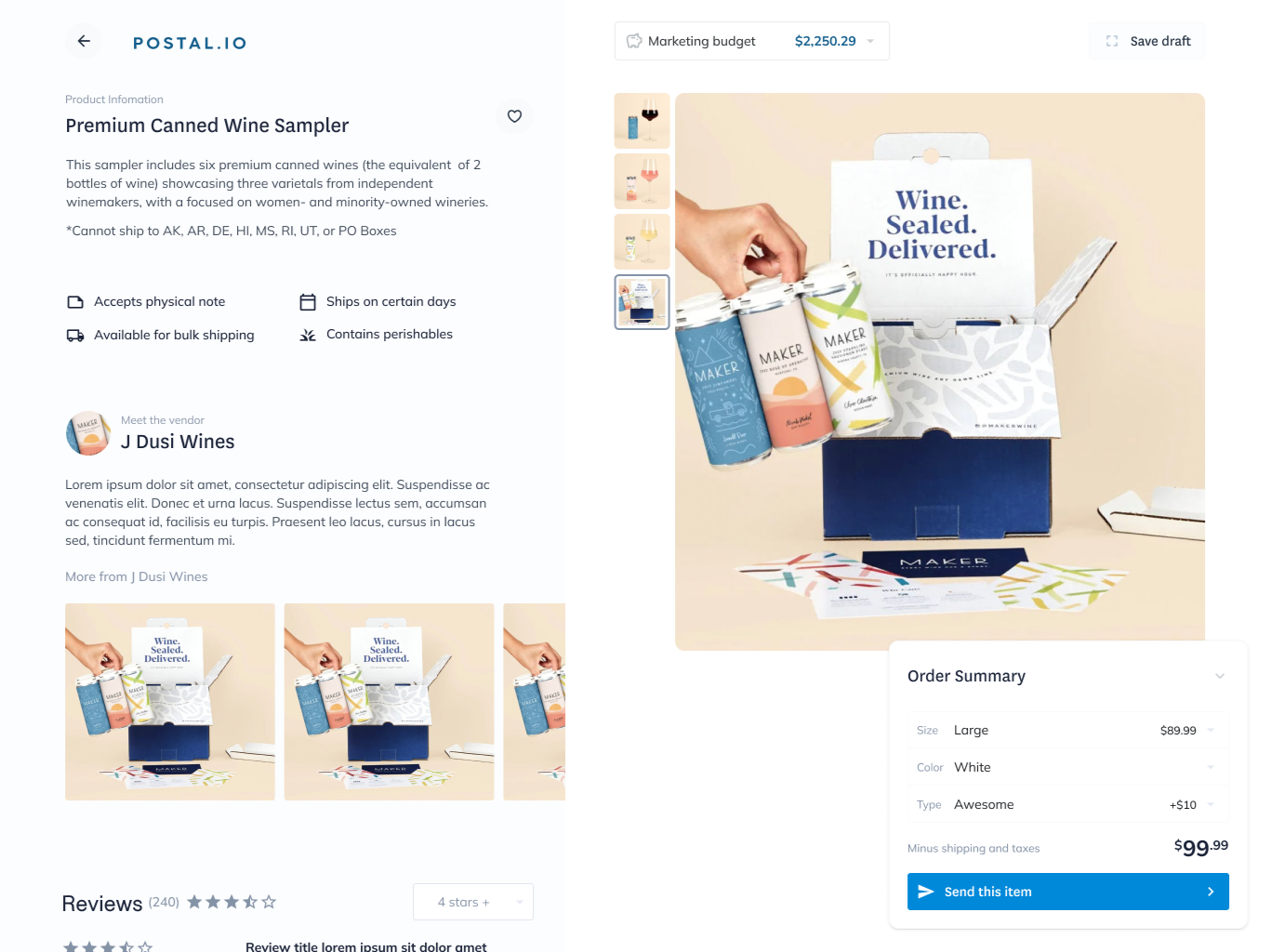 The first draft of the app, showing the product screen.
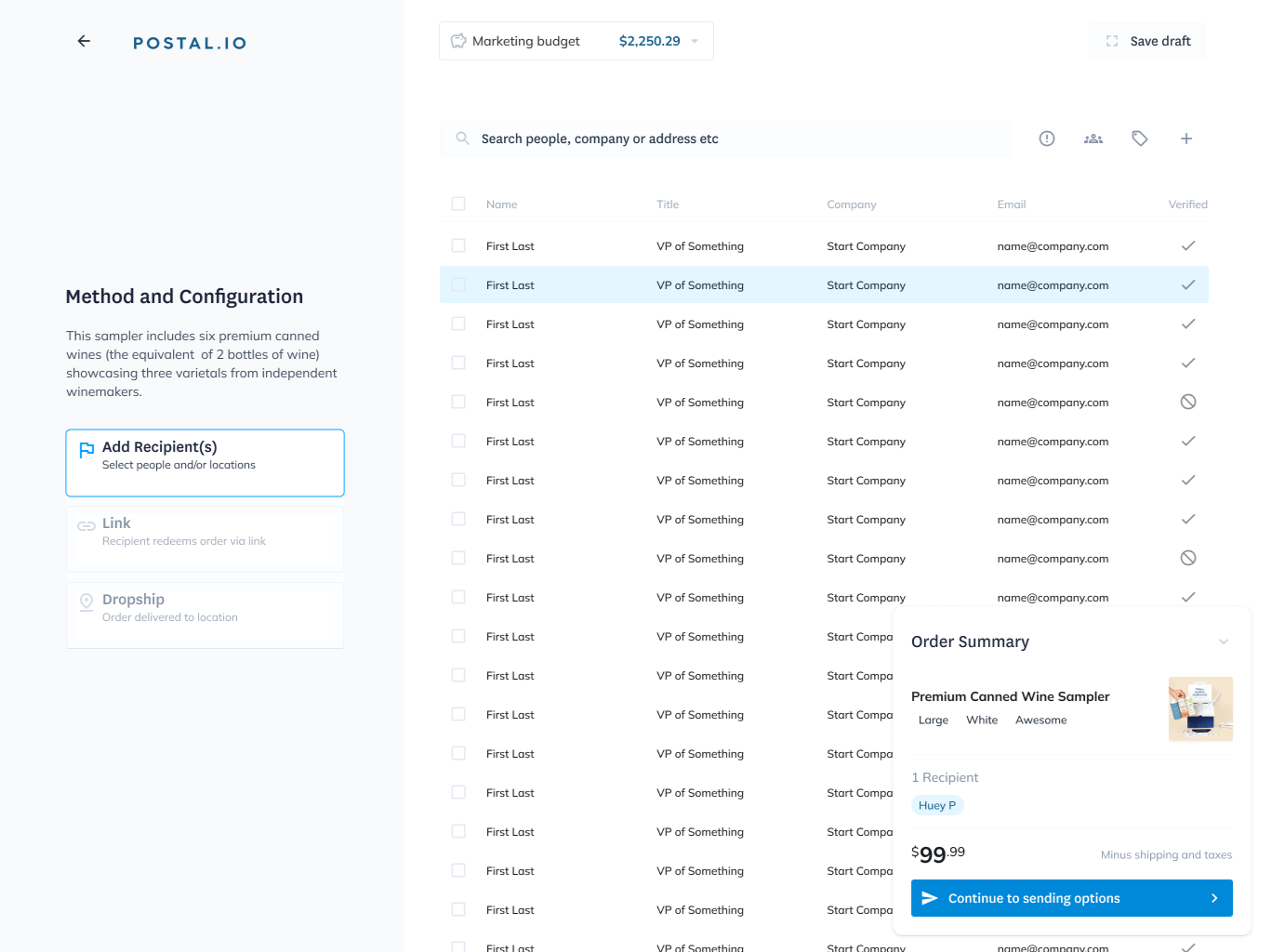 The first draft of the app, showing the configuration of the sending the product.
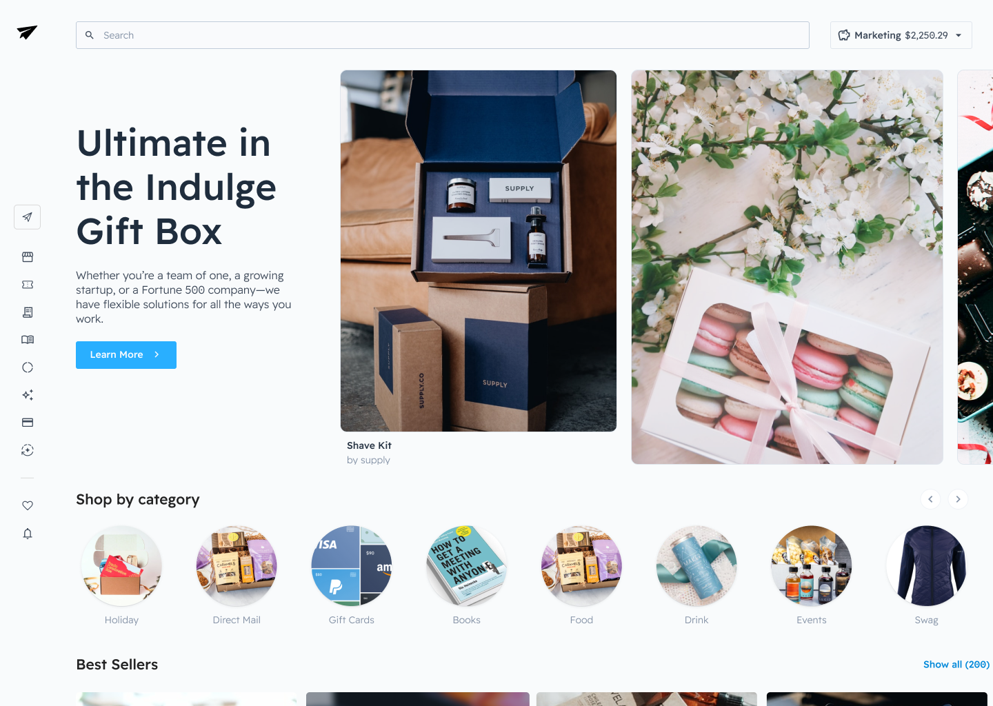 Sidebar navigation design, showing the homepage.
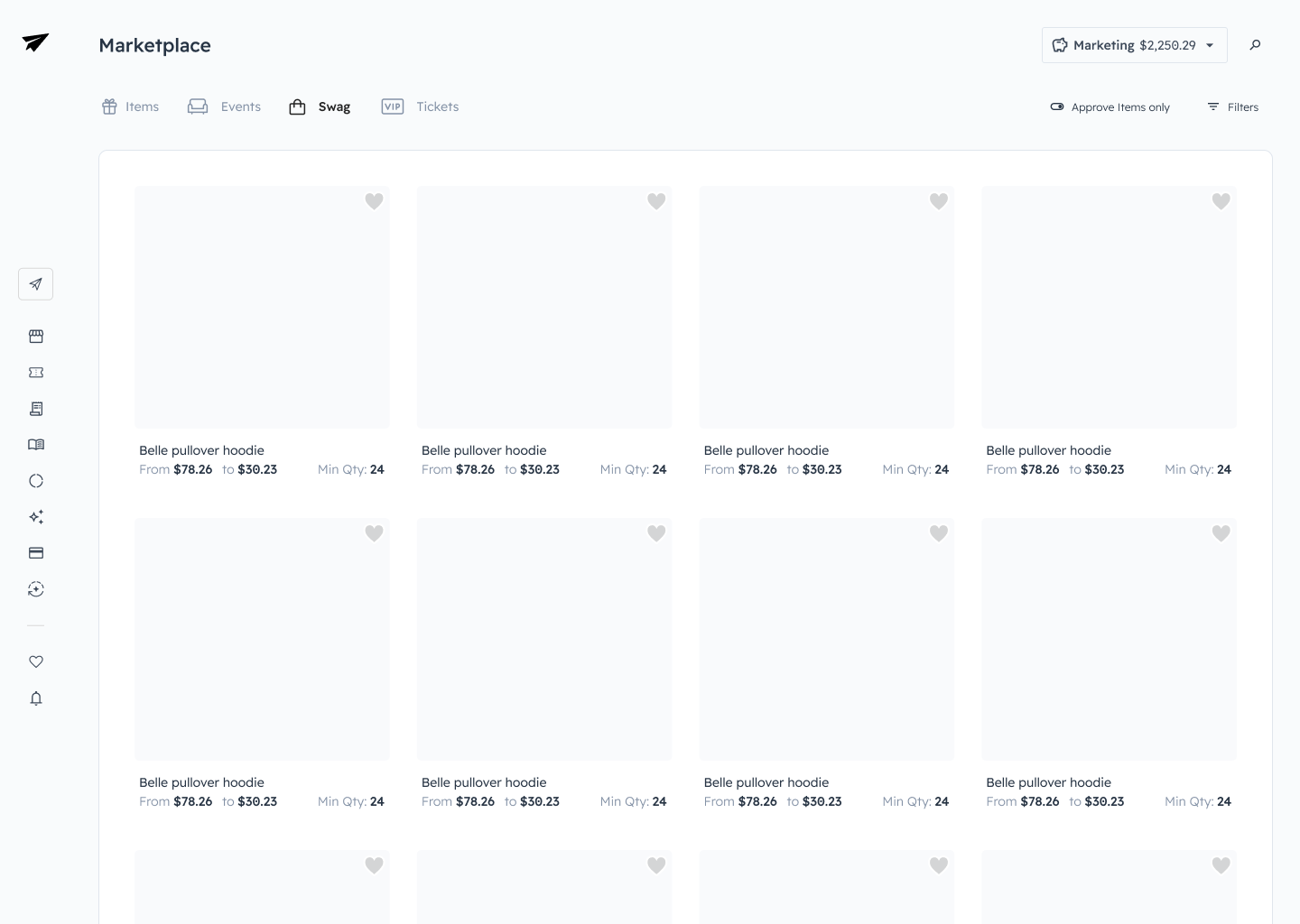 Sidebar navigation design wireframe showing the marketplace layout.
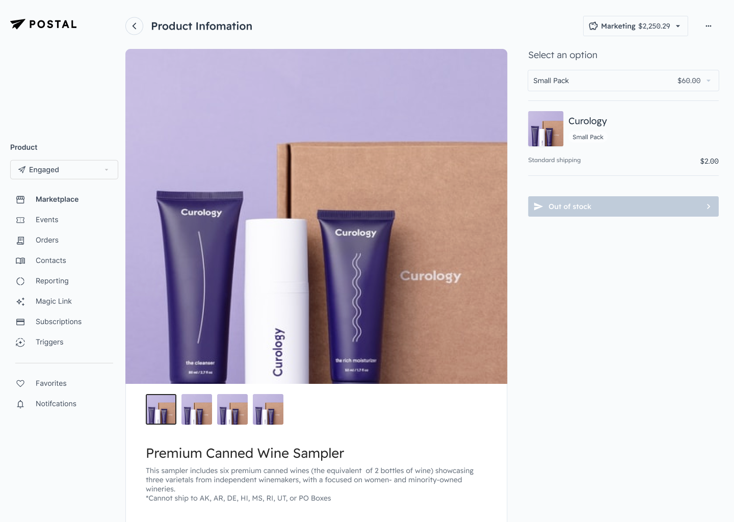 Sidebar navigation design wireframe showing the product information screen.
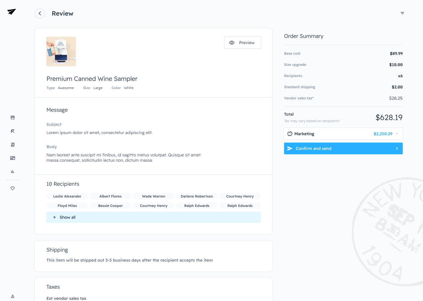 Sidebar navigation design wireframe showing the product review screen.
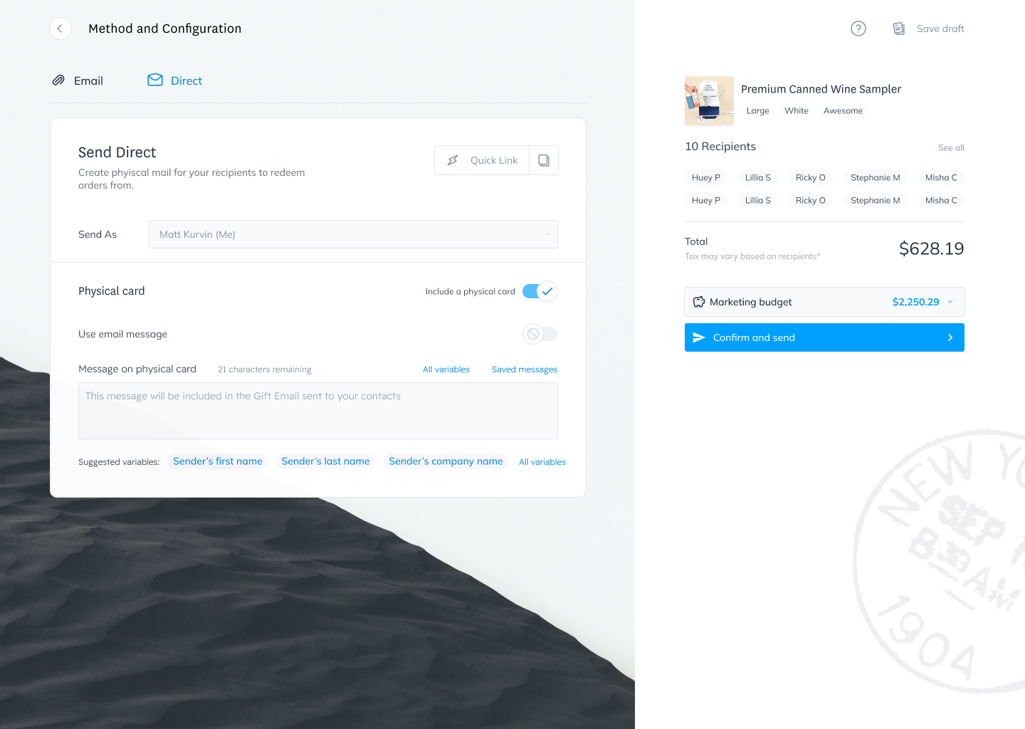 Two Column layout with a photo in the background for texture. This screen is the send method and configuration.
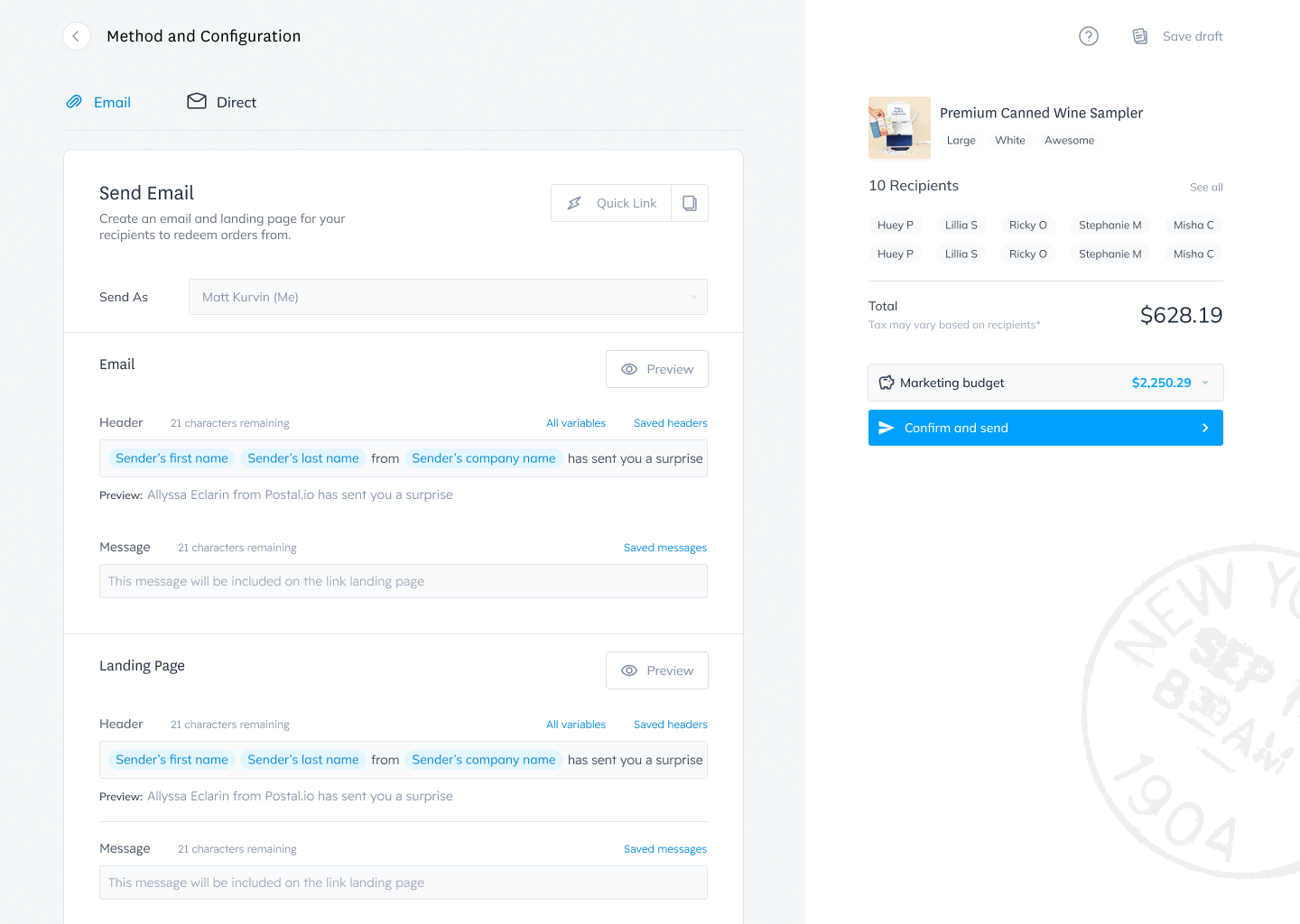 Part two of the send method and configuration screen.
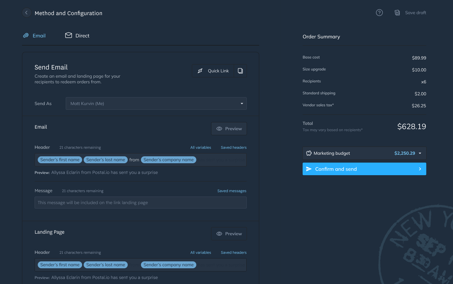 Two column dark mode screen, all the designs have a dark mode layout. Something I was really pushing for.
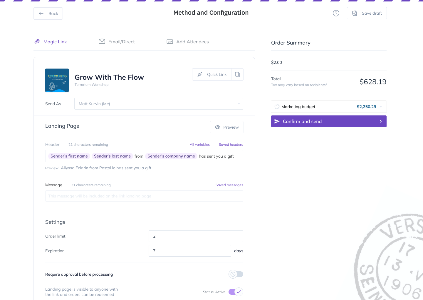 A cleaner version of the two column layout without a background image and mail stripes at the top.