Comet Comic App Asymmetrical web comic reader.
The Objective
For webcomic creators, there is no direct or easy way to help monetize your work while reaching a wide audience. Most online comic reader apps either require payment from the author to access community tools or require subscriptions from the reader before reading the creators’ works. I was brought on at the concept and development phase. My role was to create the experience, interface and identity. With my goal to create an easy to use and appealing interface.
The Solution
Comet serves the comic-reading community by establishing trust through engaging and smooth user experience, dashed with a pinch of colorful whimsy. A unique asymmetrical design and flattened navigation system help achieve this. The goal is to empower authors by helping them reach the widest audience possible by having a free to read model while allowing creators to monetize their creators through physical products like prints, books, and clothing.
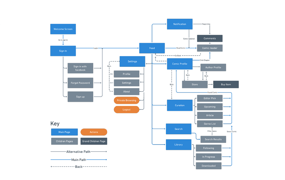
Flowchart
Simplifying the interface was a key goal in this project. To achieve this, I flattened and combined pages to reduce the use of the back button.
Iterations
Comet went through a few rounds of designs and different directions. With each design getting tested by a group of over 20 college students to test the usability and visual look.
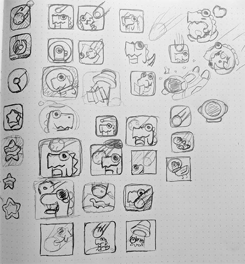
After Sketches a few rough ideas for the different screens. We took the best ideas and turned them in medium level fidelity mockups before coming to final designs.
-
 The first draft of the app placed a heavy focus on gesture based navigation and full-screen illustration from the comics. This direction did not test well users. With many participants having trouble finding and navigating to features.
-
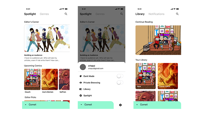 Second draft split navigation was tested better than the gesture navigation. But 32% of user-reported being confused about the spit segment control and how the bottom navigation worked. Users did respond well to the asymmetrical top image calling it modern looking.
-
 A smaller iteration change that kept the layout of the last version while trying to address the navigation issue. While users were able to navigate better than the last version. The user reported the brightly color interface was distracting and took away from the art.
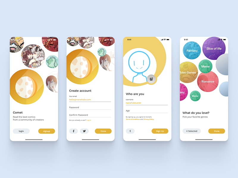
Branding
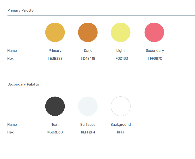
A strong geometrical shape with subtle page-flipping elements creates purposeful movement while calling back to the comic reader theme. A subtle gradient background allows the Comet badge to pop off the background, improving its presence on various assets like app icons and favicons. A yellow and mustard gradient was picked for its ability to draw attention with a gradient was used to give the app a more modern feel.
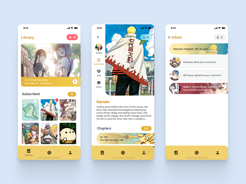
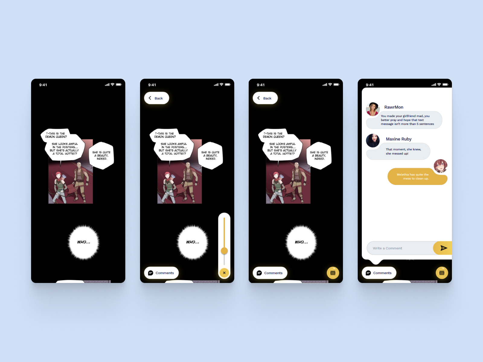
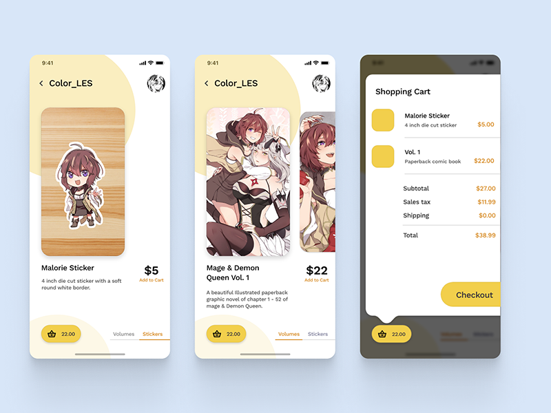
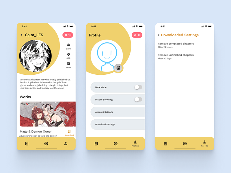
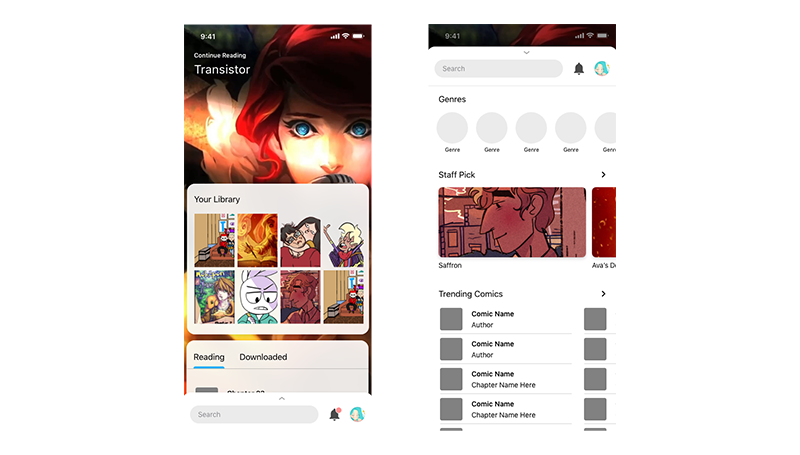
Final Screens
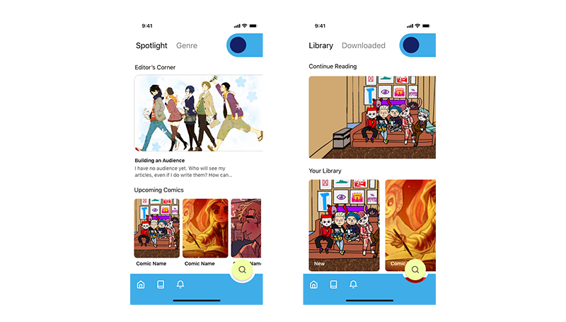
In our usability testing, out biggest issue was the navigation. With the final design, I resolved the problem by using a standard navigation bar and improved the visibility of button and functionalities by giving them a solid background color and borders.
The final design also kept the asymmetrical design that was popular in the previous designs. This allows us to maximize the places to show the comic artwork by using preview links as masking elements. The rest of the graphical elements are made up of circles and blobs shapes with all corners rounded to give a playful and friendly feel.