Abundance Collective is a group of vetted professionals in the real estate field in the western Oregon area. Everything a real estate seller would need to run a business from home builders, painters, brokers, insurance providers could be found. I was brought onto the team very early in the founding to create a branding a simple landing page for the collective.
Before I brought onto the team another designer was hired and product the design above. I was told that the team liked this direction so kept going in this direction for the next few designs.
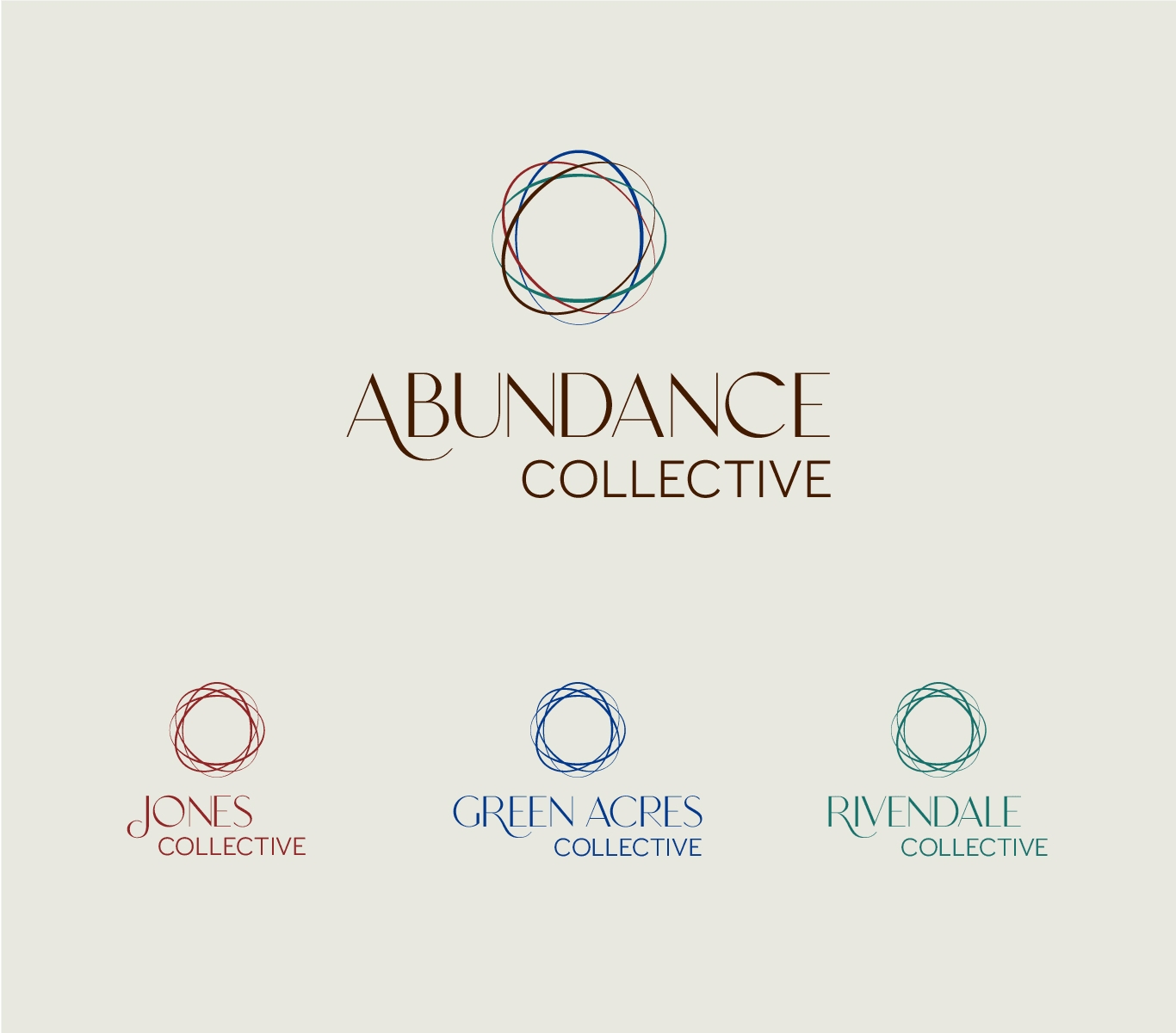
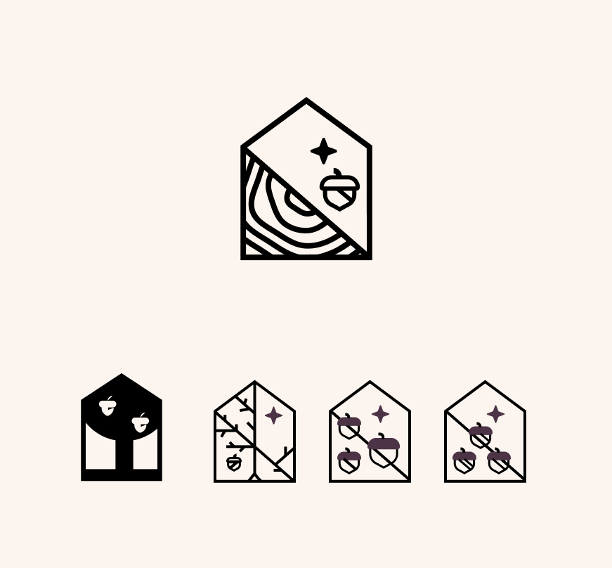
 Concept logos before I joined to take over the design
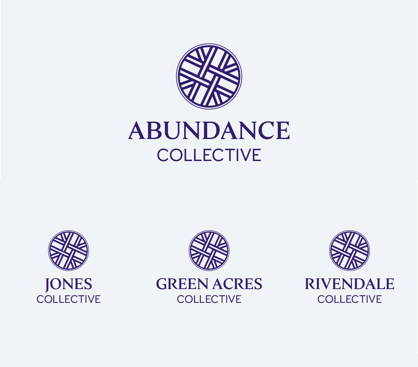
For the first two directions I tried to keep various elements from the previous work. While trying to play off the idea of connection with overlapping shapes.
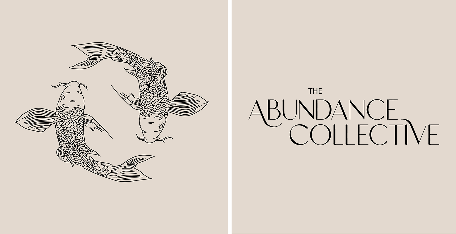
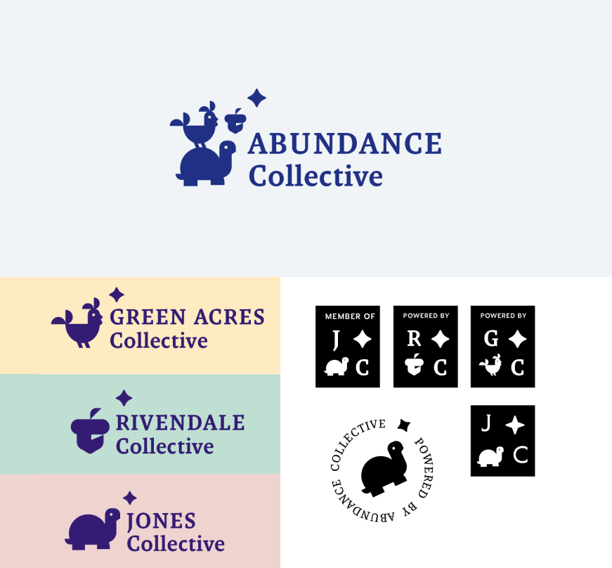
Third round
The foundered was not happy with the direction and said that he wanted the sub brands to more uquine and reflect the area they were going to serve. So for the next draft he gave me very specific rules.
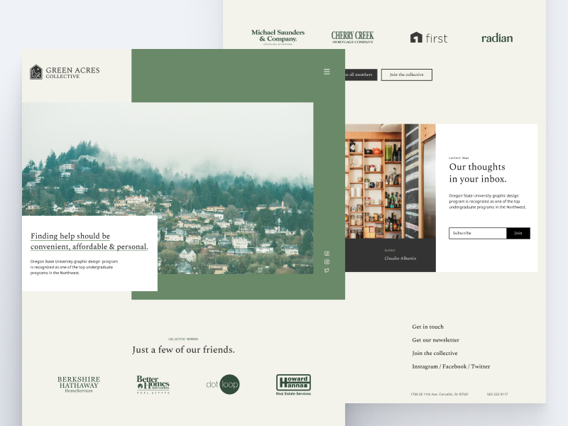
Green Acres
- green in color
- Must feature a chicken in the logo
Jones
- Had to be yellow
- Must feature a turtle in the logo
Rivendale
- Must feature an oak tree
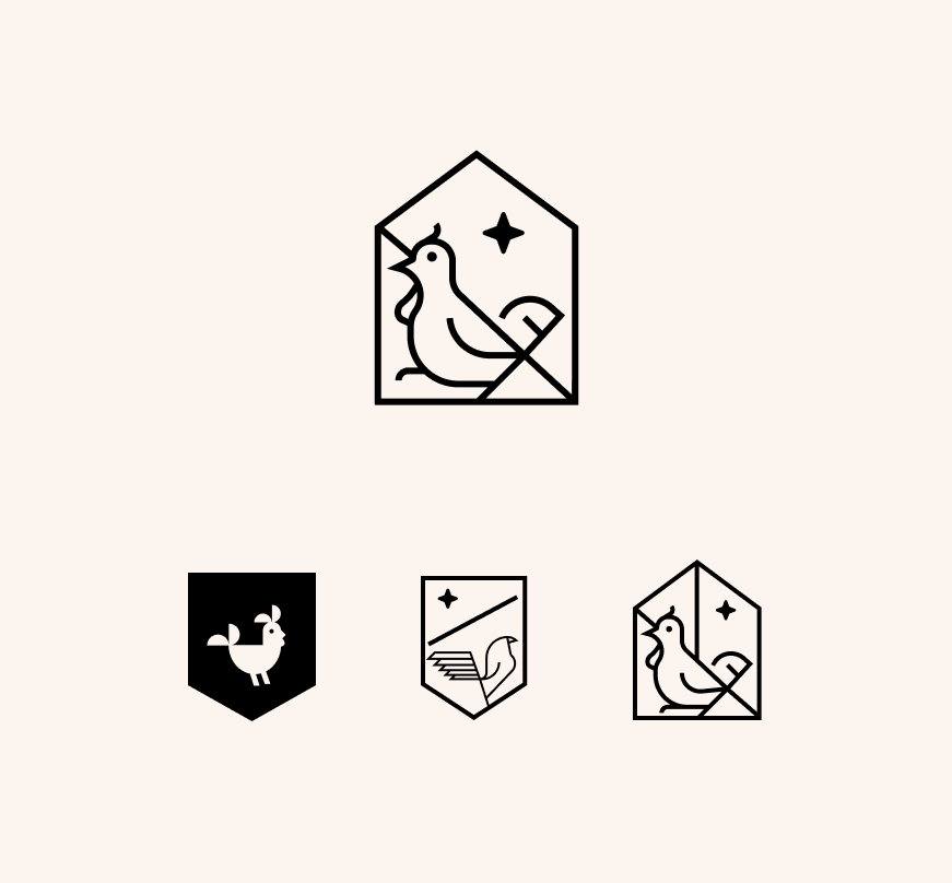

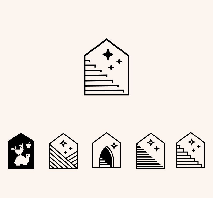
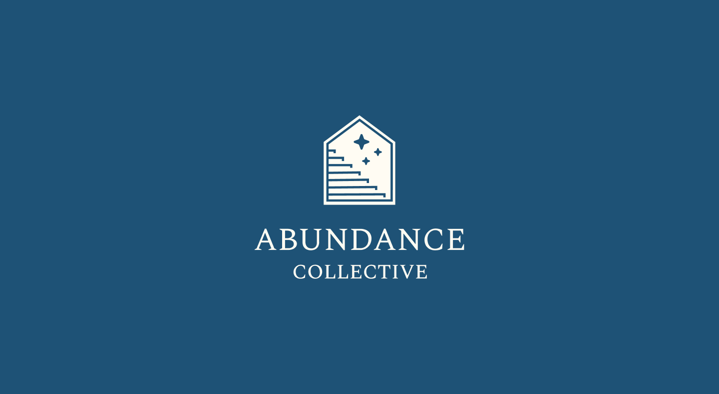
The first version of the third round the team did not like the thicker versions of the animal or colors in the first slide. They wanted something more professional but did like the star tying all the brands together and the lighter serif type in the circle lock up. After some refining I ended up with the lineart mark incase in a house emblem.
Final Logos
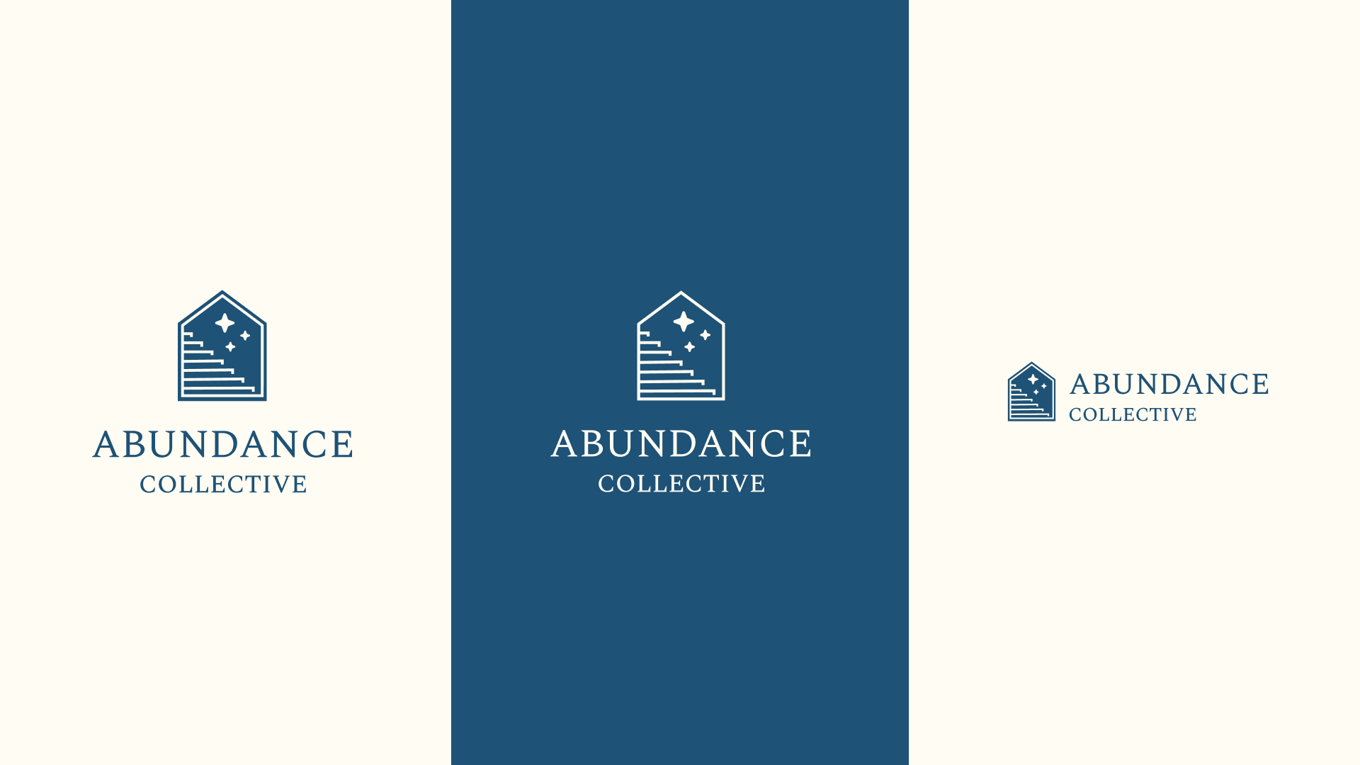
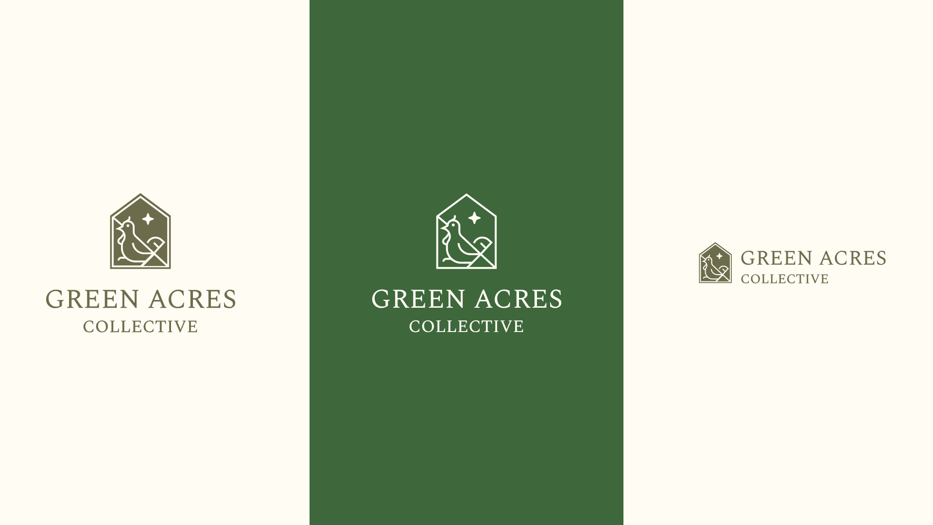
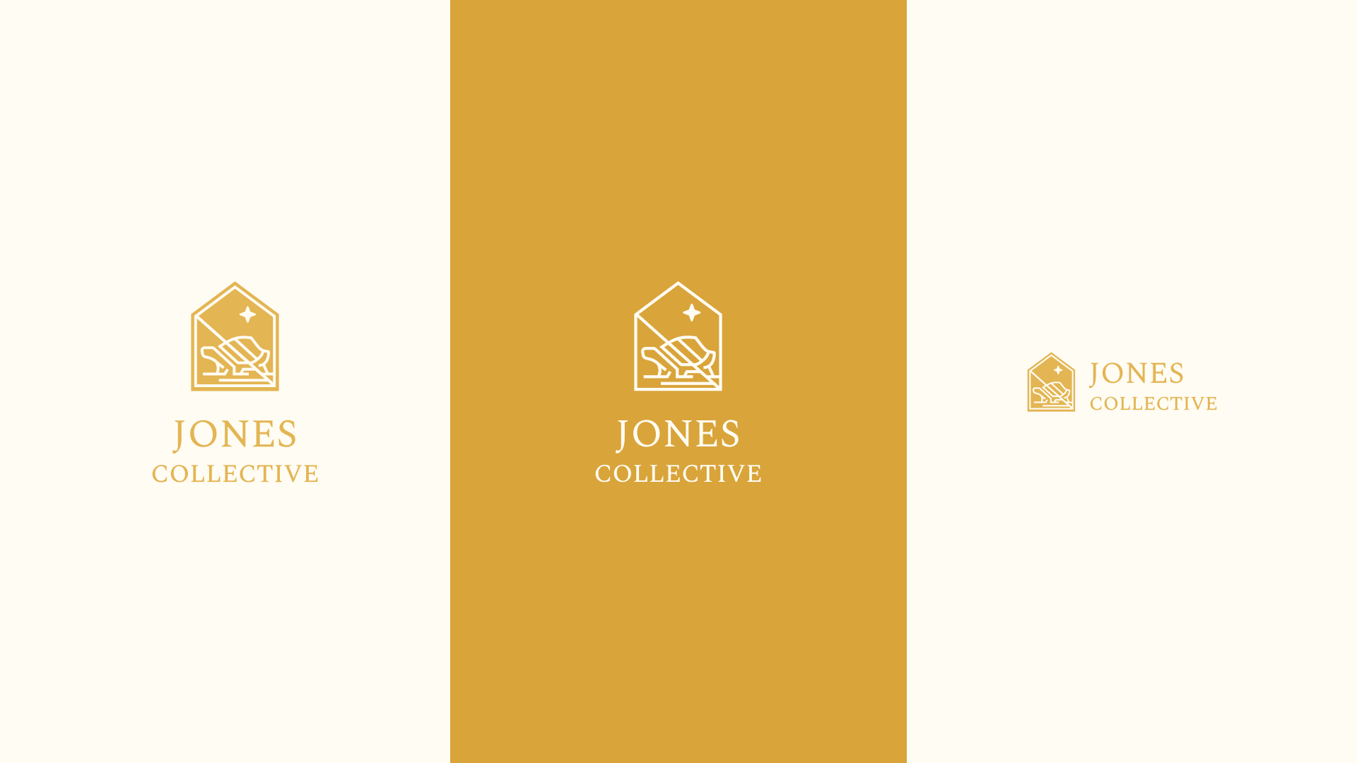
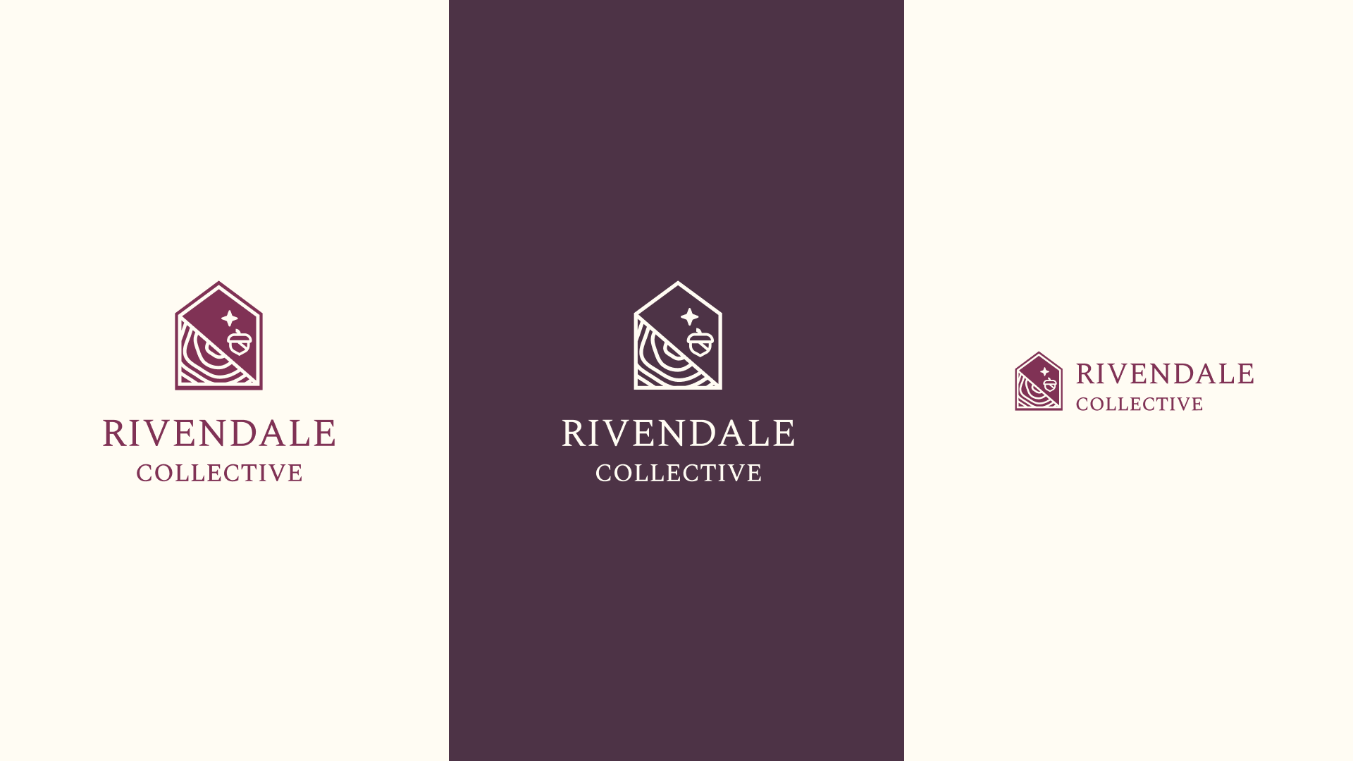
To make sure the sub branding and the main abundance marks felt consistent with each other each mark shares 3 different elements. First the diagonal line provides some movement and something for the subject to interact with.
Second the north star highlight abundance collective mission to guide people. Then finally the house emblem that contains everything and make sure that each mark is have a consistent shape.
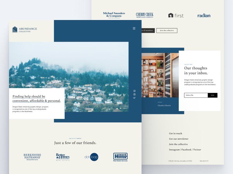
Website
While the website was put on hold in favor of rebrand the Rist Group. The home page layout was approved. Below is the landing page for the Abundance Collective and the Green Acres Collective.1