Punch Clock
Interface Design • User Experience • Development
Punch Clock is a simple time tracker that is hyper-focused on two core features: recording time and calculating an hourly wage. That’s it, no extra features, no hidden cost, no login required. The web app simply saves your task and hourly rate to your computer so there is no need to keep your browser open just click start and come back when you’re done.
Problem
In my experience, time trackers, are full of features. CRM, invoicing, graphs, and charts. While these are useful features they result in a cluttered and stressful experience. While you can make the argument that if I didn’t need the features I could just ignore them. The one thing I couldn’t ignore was the effects on laptops’ battery life.
Most time trackers like hellobonsai, toggl, and Harvest have a thing called the active timer. The active timer is a real tracker of how long you have been working for usually by the second. Because it is real time and updating every second it means your computer is constantly updating the timer and rerendering the interface every second which is killing your battery life.
Punchclock gets around this by acting like an old school punchclock system. By only recording your start time and end time than doing the math between them to get you total work time than updating the interface instead of running 3 functions per second.
Design & Iterations
First, I researched other competitors to differentiate Punch Clock and create something brand new and unique. I didn’t try to copy what was already done; the goal was to understand what works and what’s useless.
As a result, I removed clutter features such as the seconds counter and charts. In their place, I added context-sensitive input fields to clearly define when the app was tracking.
-
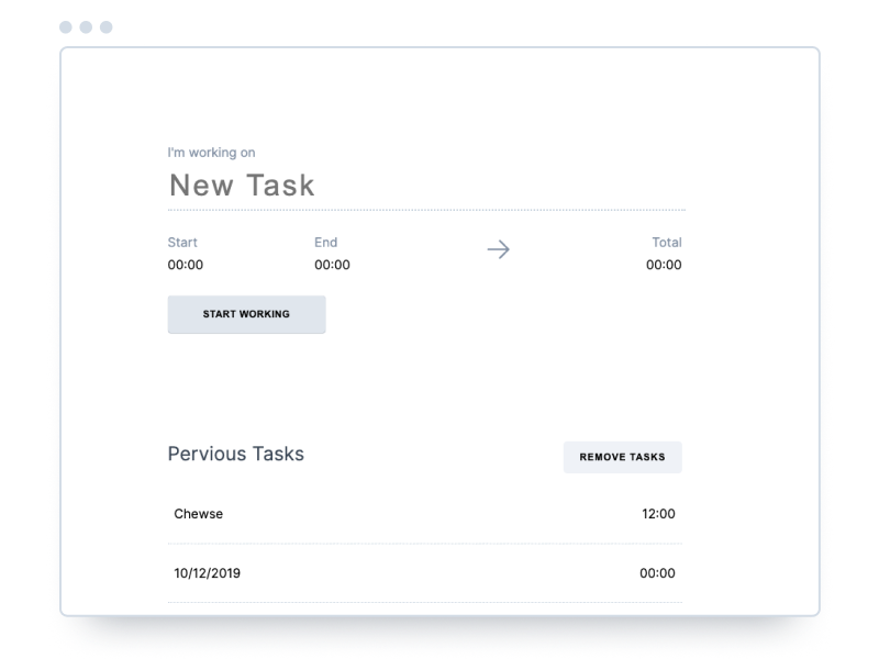 The first draft did not look very pretty and had unnecessary elements like the end time and arrow. With the biggest problem being how the different sections of the app did not feel like they were connected.
-
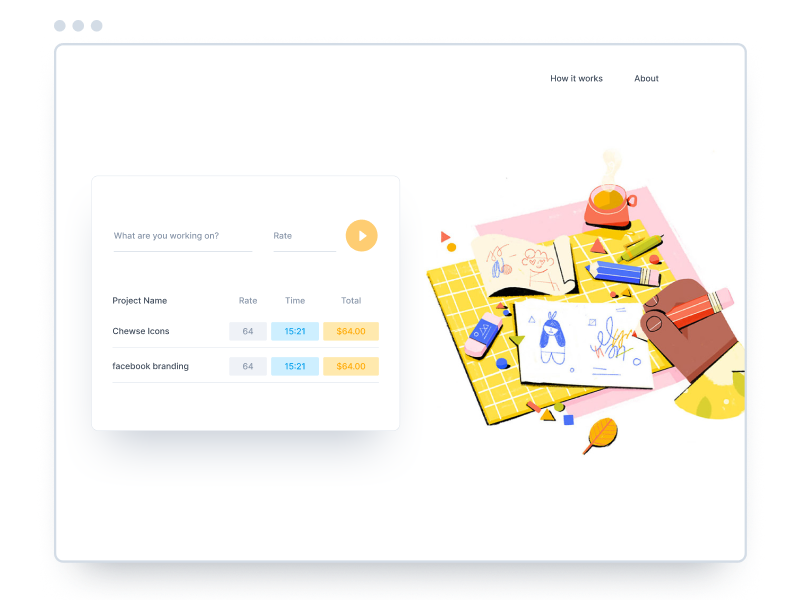 This version of the app tried to address the problems with the previous one by condensing the interface and giving the user more information. While adding the option to set an hourly rate. It also included an illustration to help fill in the extra space.
-
 The last iteration before the final design. Removed a lot of the colorful elements in favor of a cleaner interface. While showing pops of colors to show that the app was responding to the user inputs. While keeping the dual-panel layout to make the most of the space for desktop users.
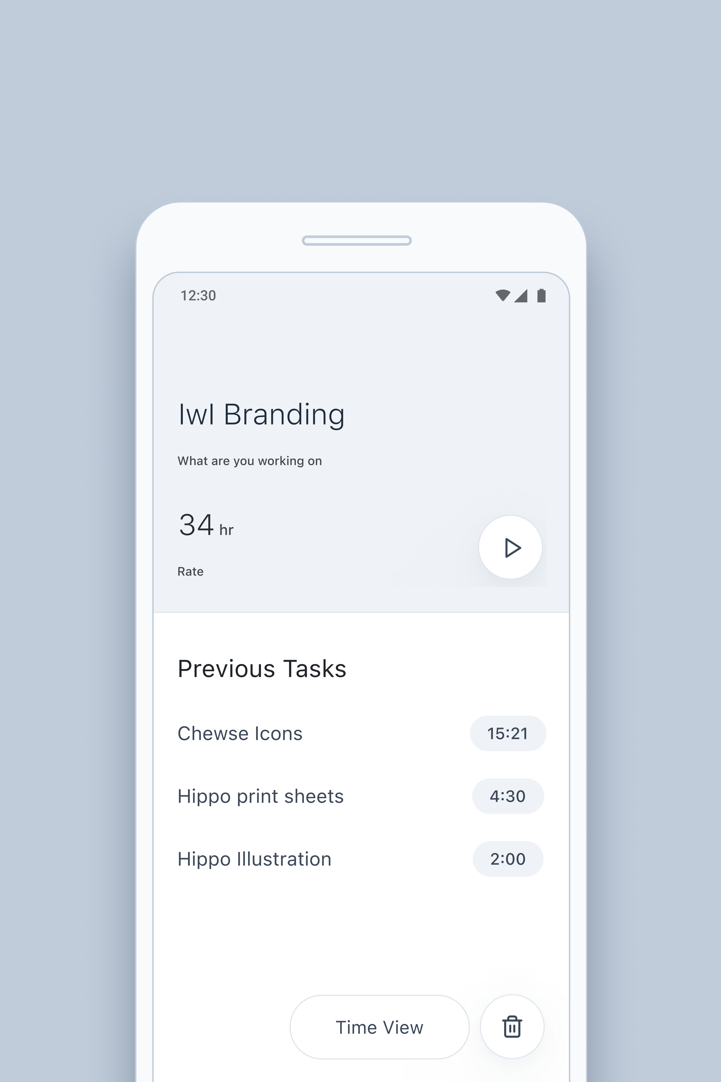
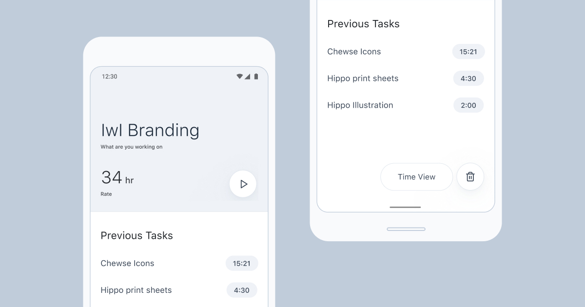
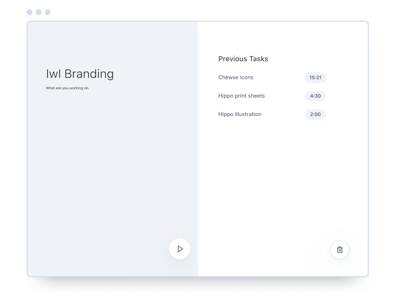
Final Design
I knew from the beginning that I wanted to make the Punch Clock interface straightforward and as minimal as possible. It went through three major design changes before landing on the final design.
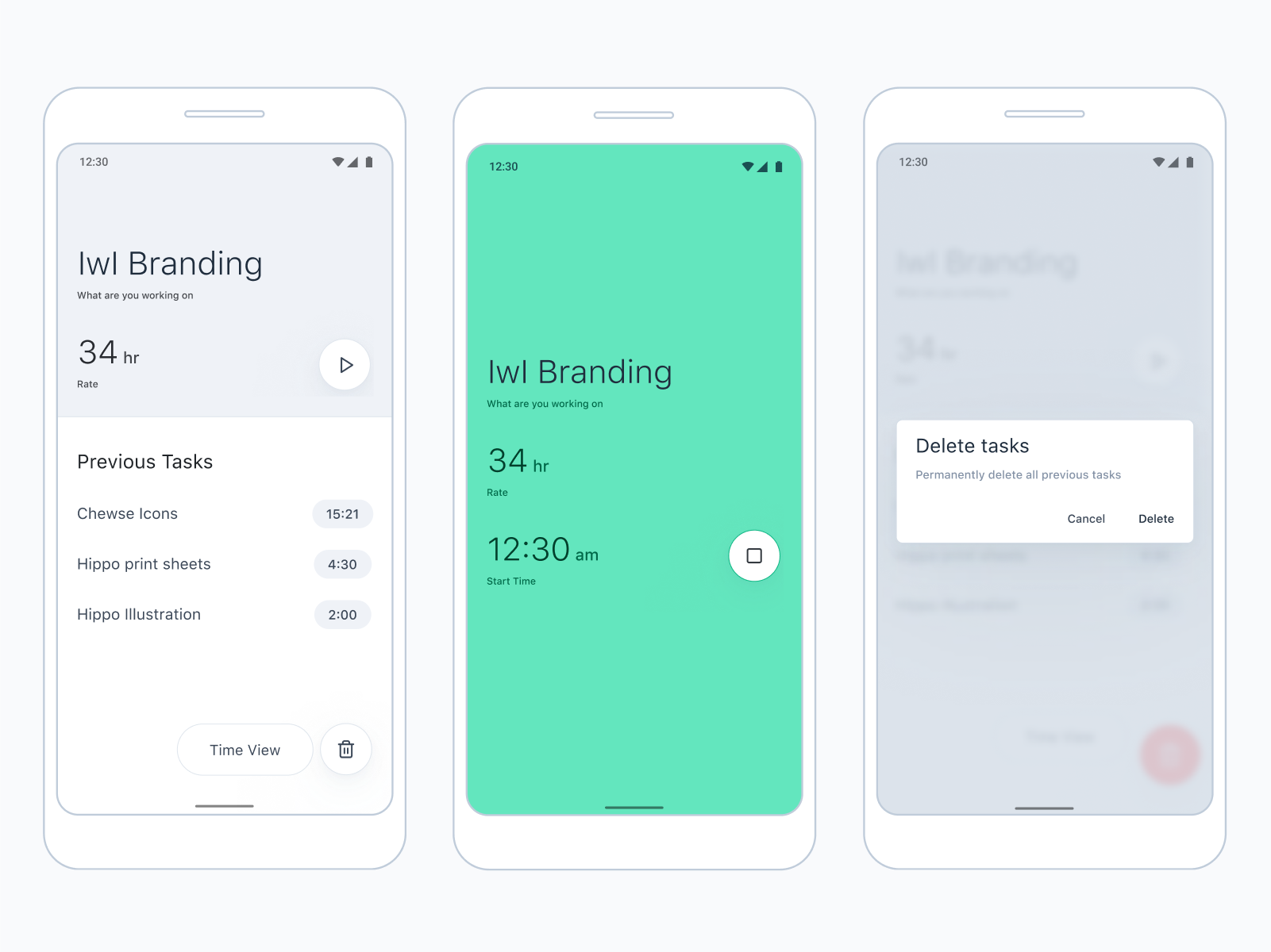 ↑ Final Design
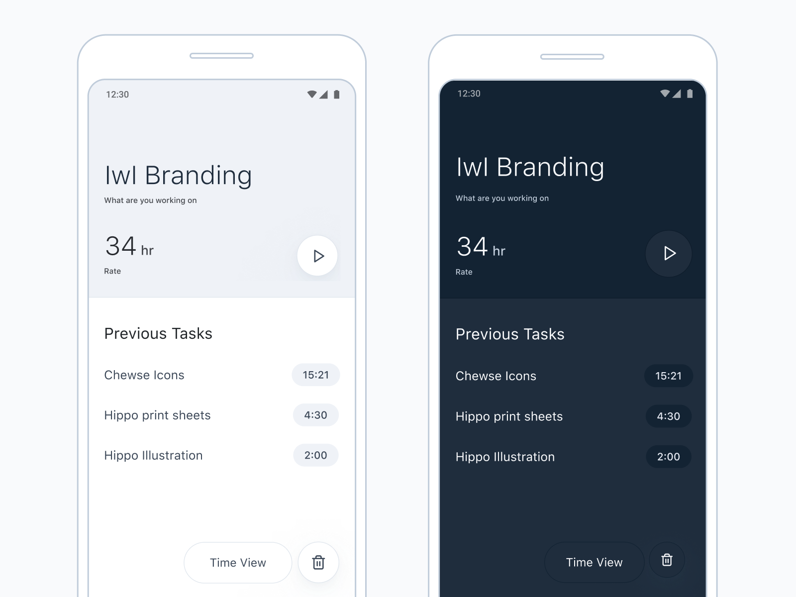 ↑ Light & Dark Mode
Development
Punch Clock pushed my development skills to a new level. While I am used to prototyping user interfaces in HTML and CSS I rarely use JavaScript.
The two biggest achievements were the ability to save and read data to the user’s computer which eliminated the need for a backend or user accounts – and the battery saving feature. The app functions just like a regular punch clock recording a clock-in and a clock-out and subtracting the difference hence the name of the app.